Capital Fencers
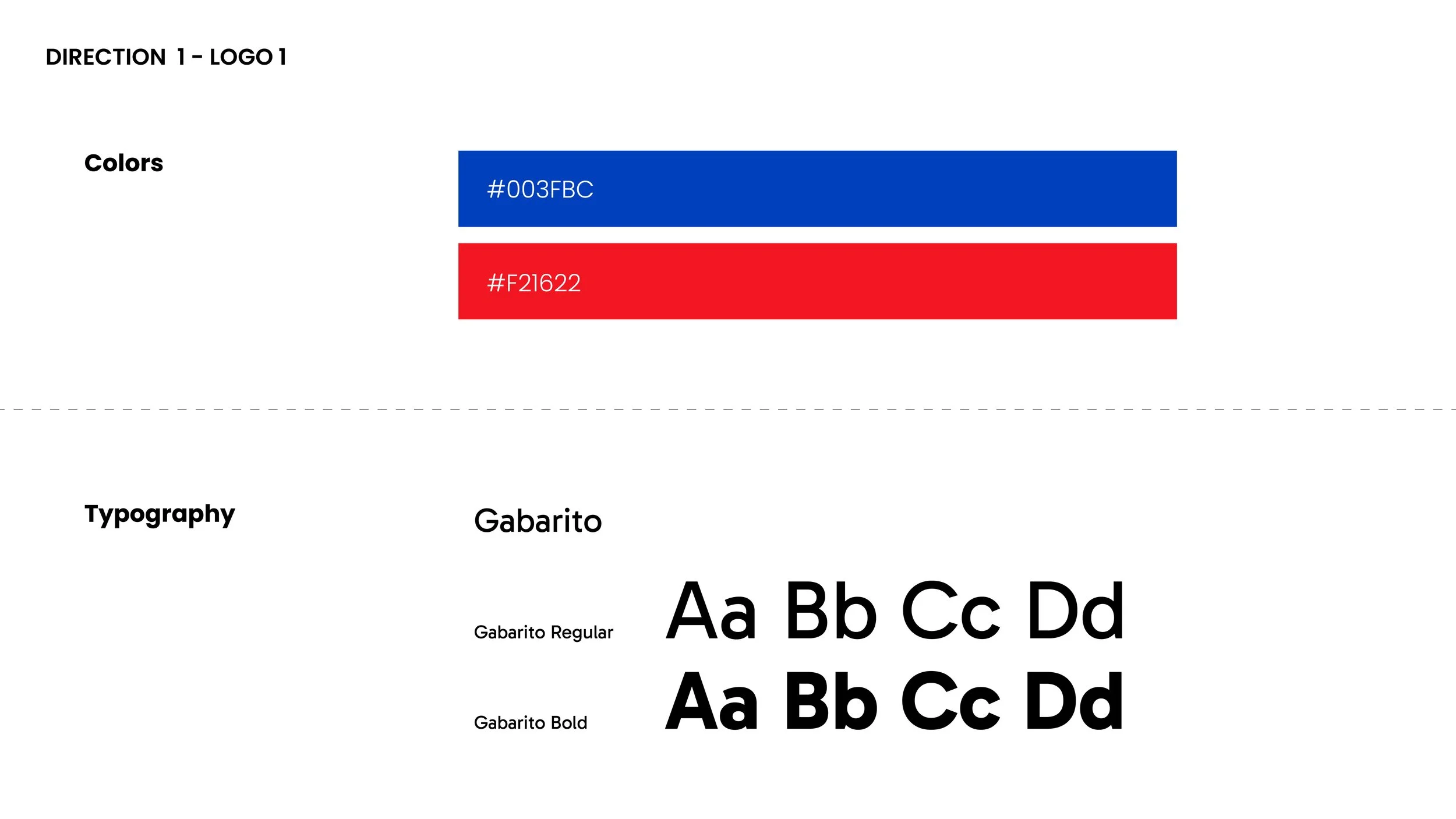
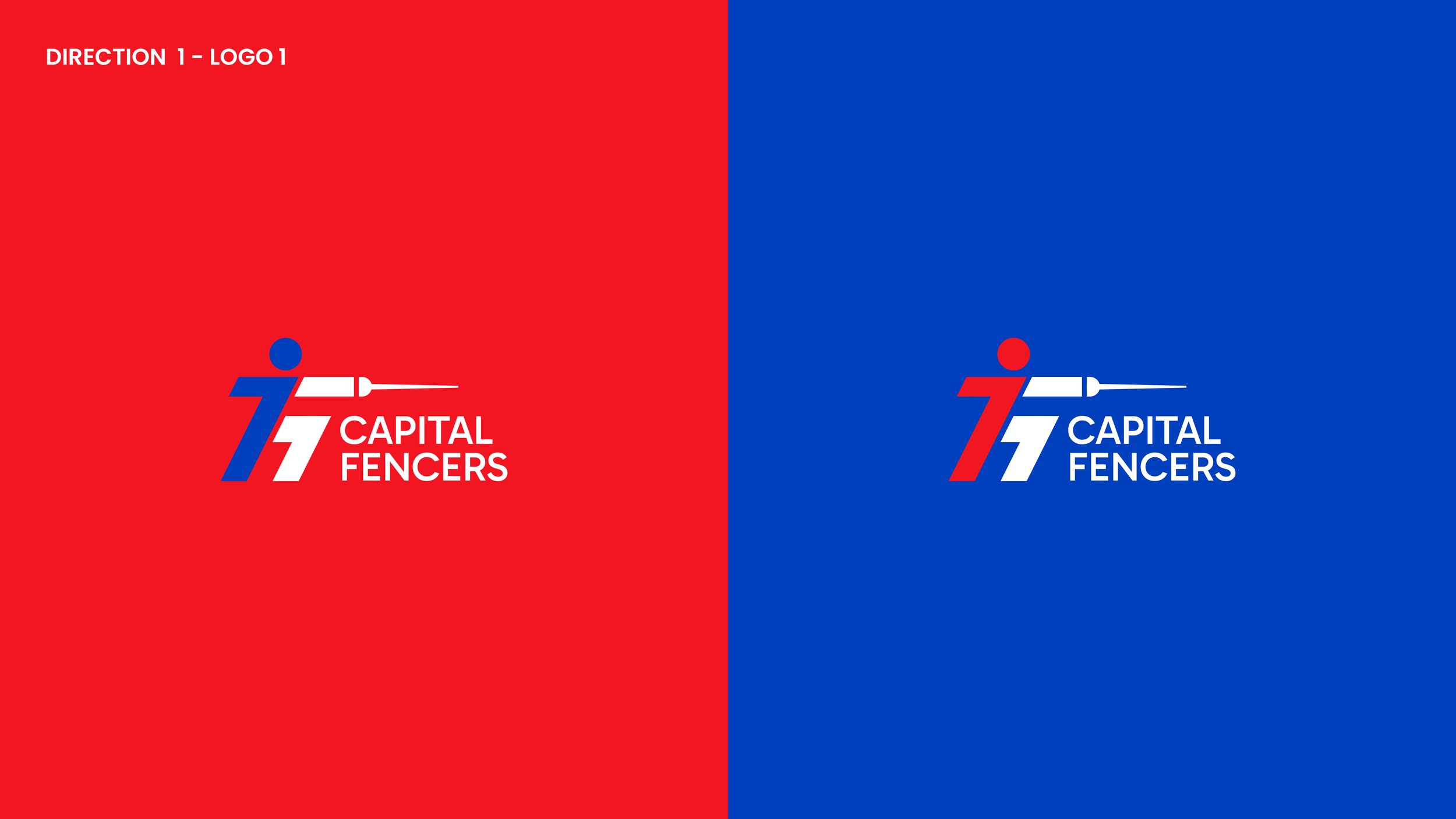
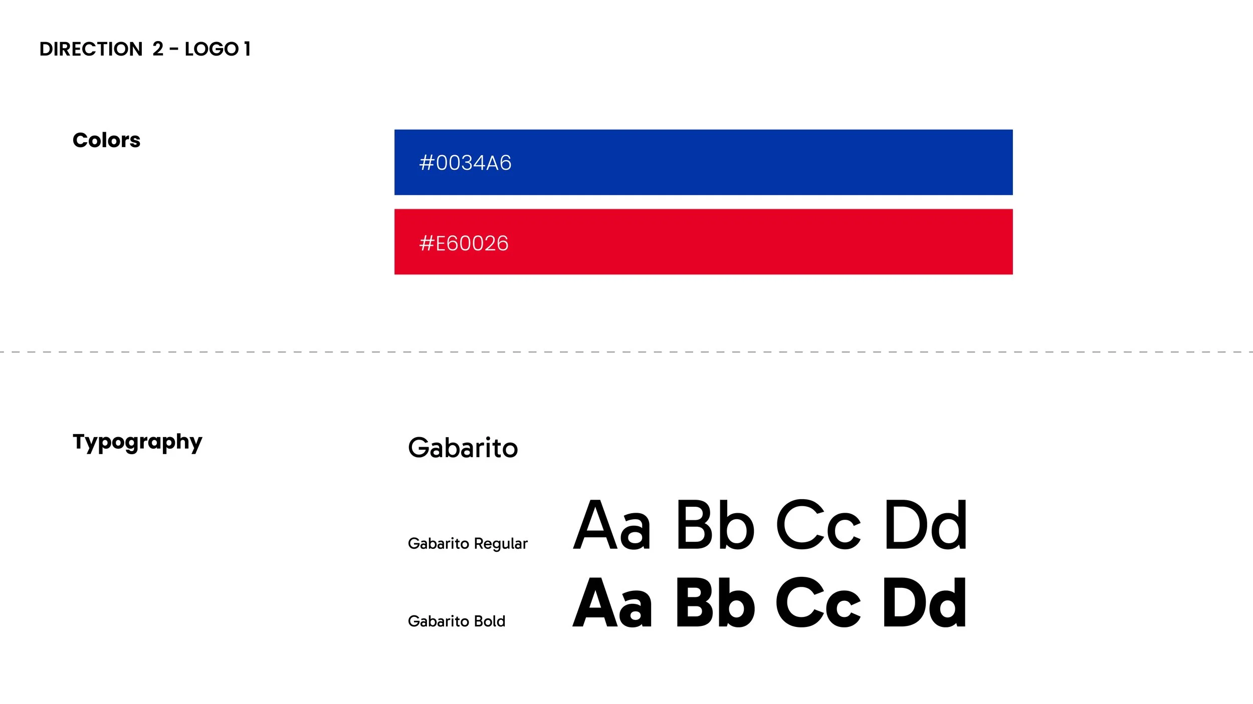
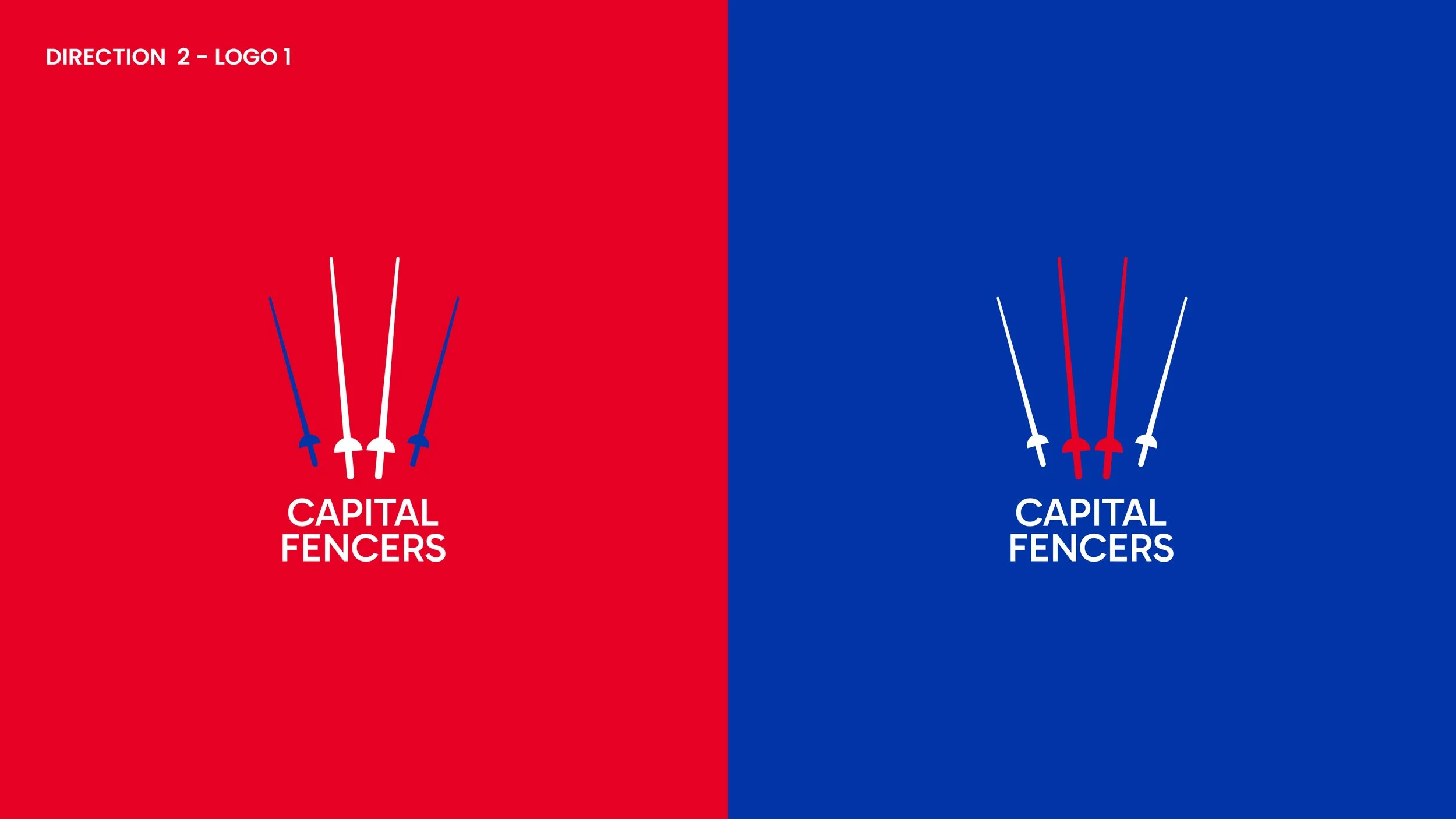
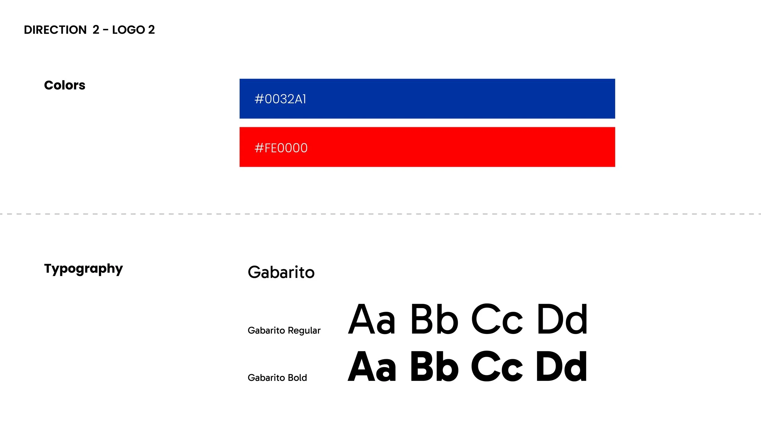
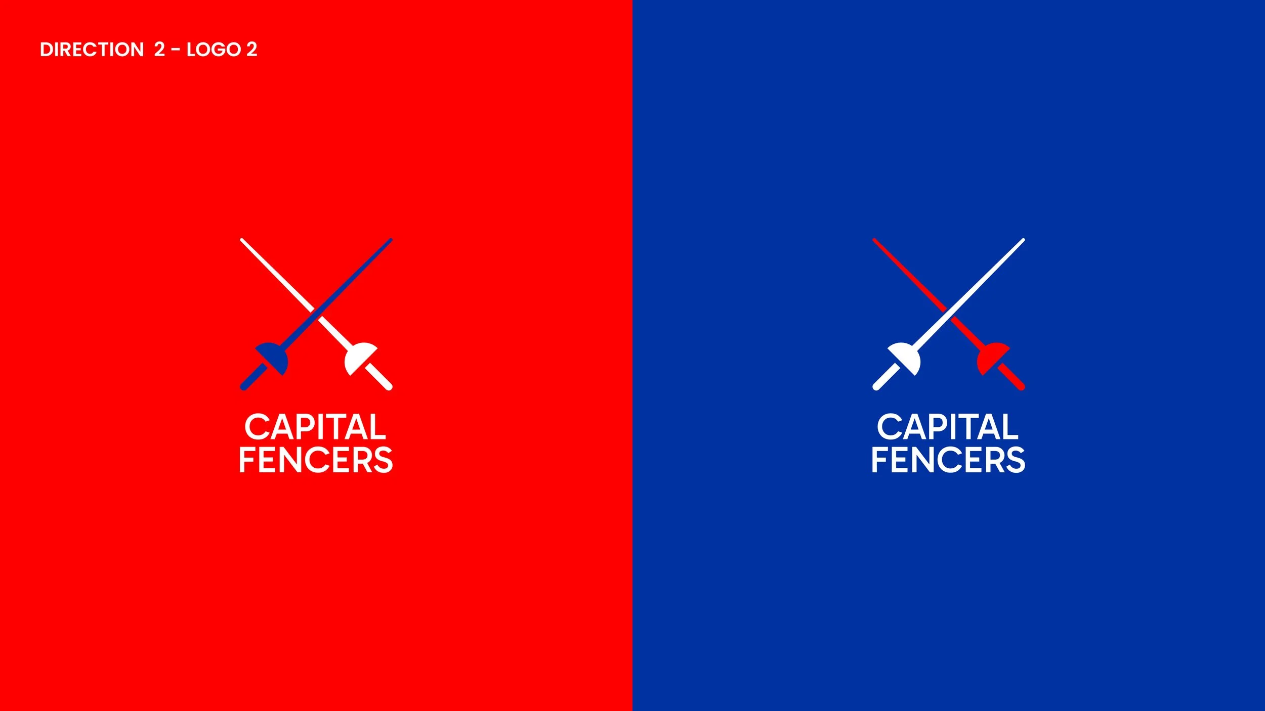
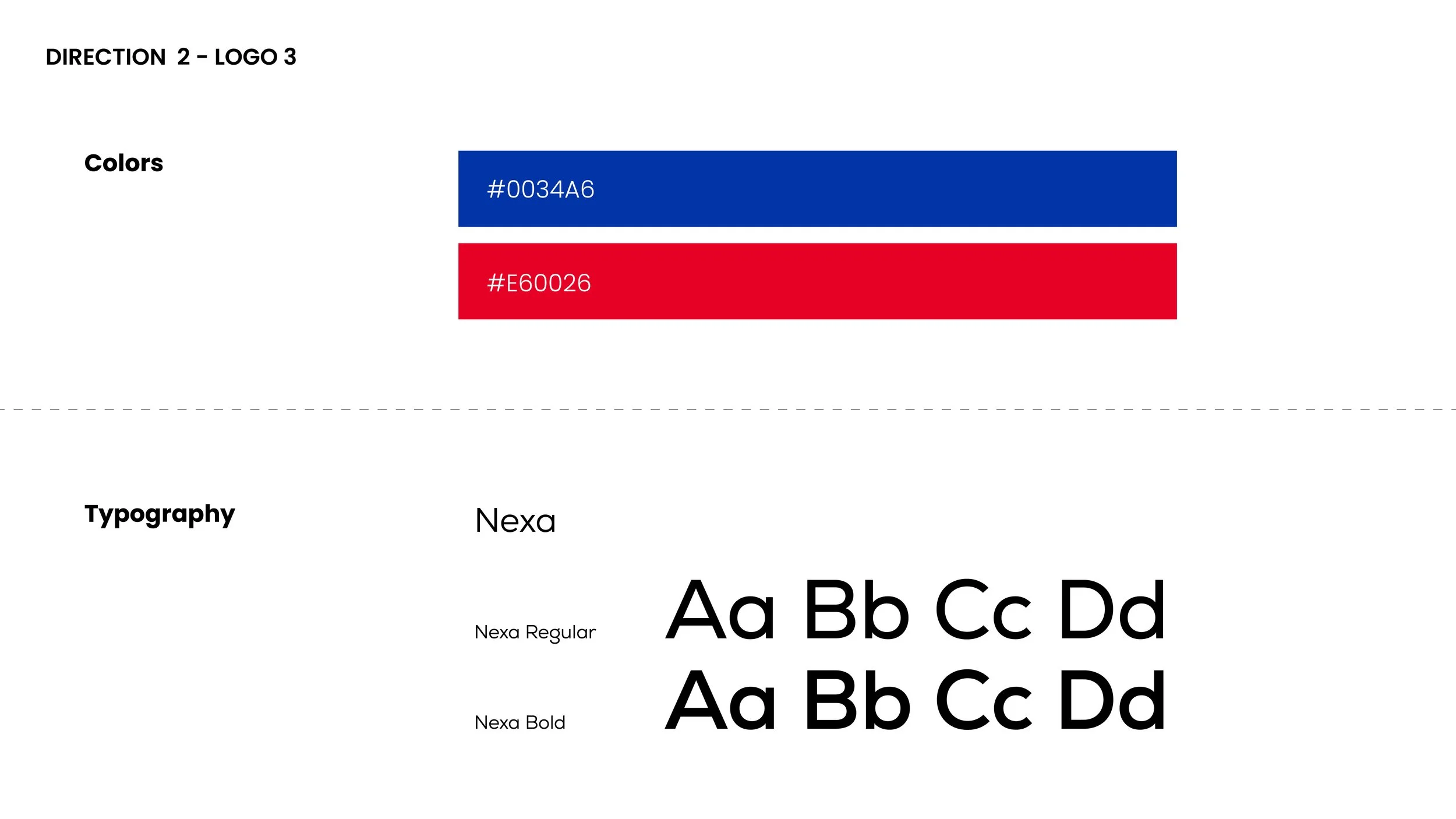
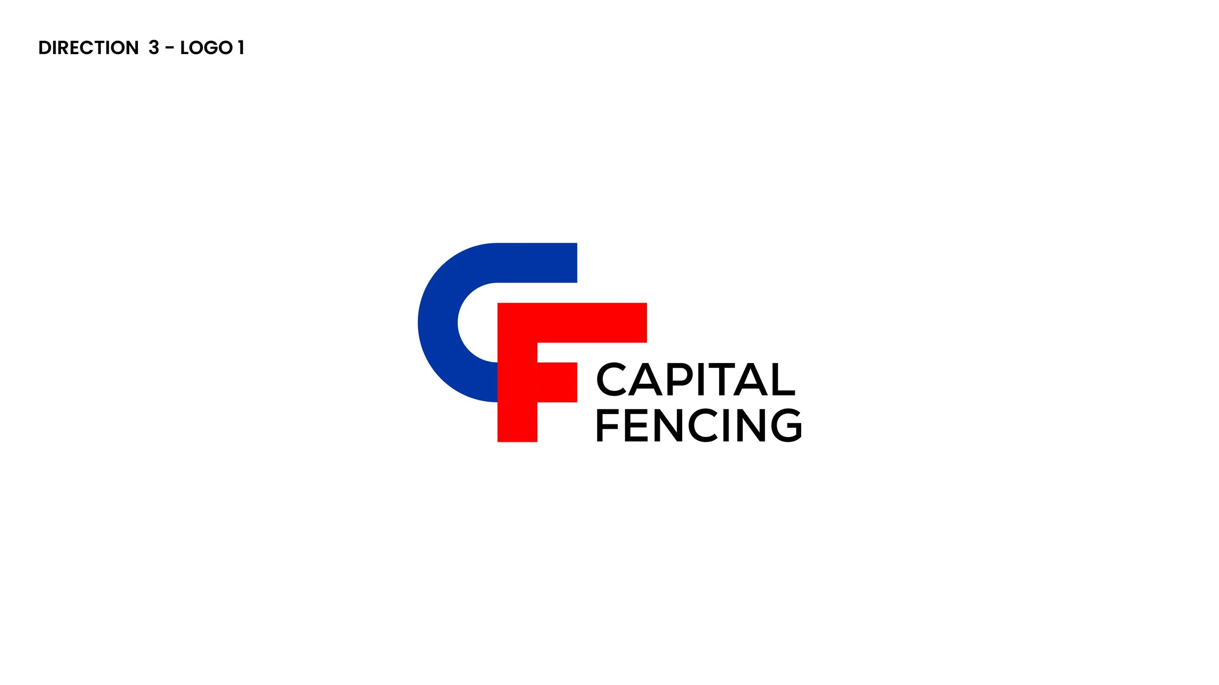
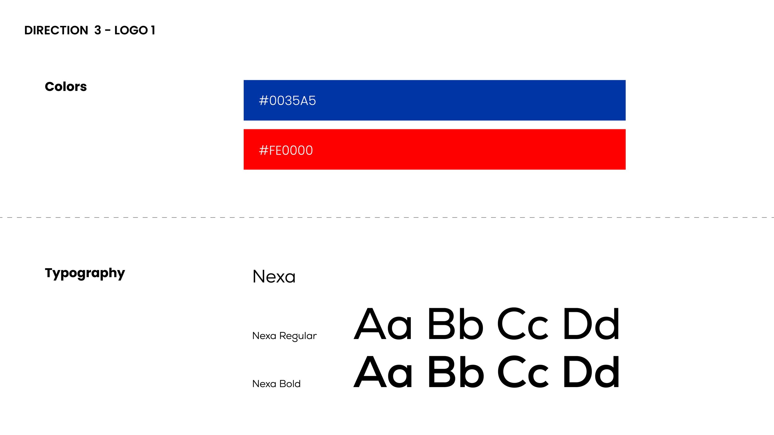
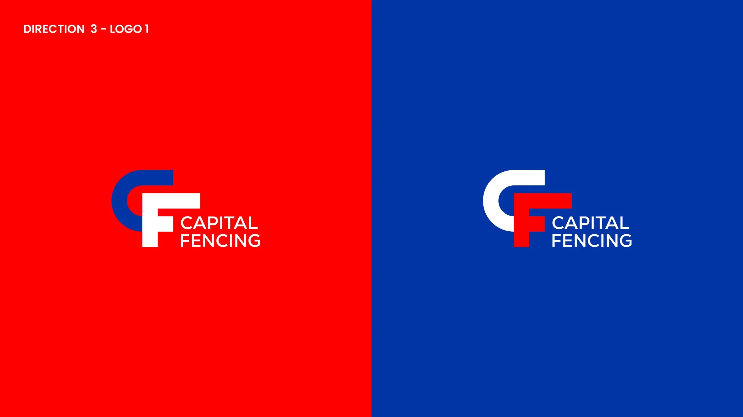
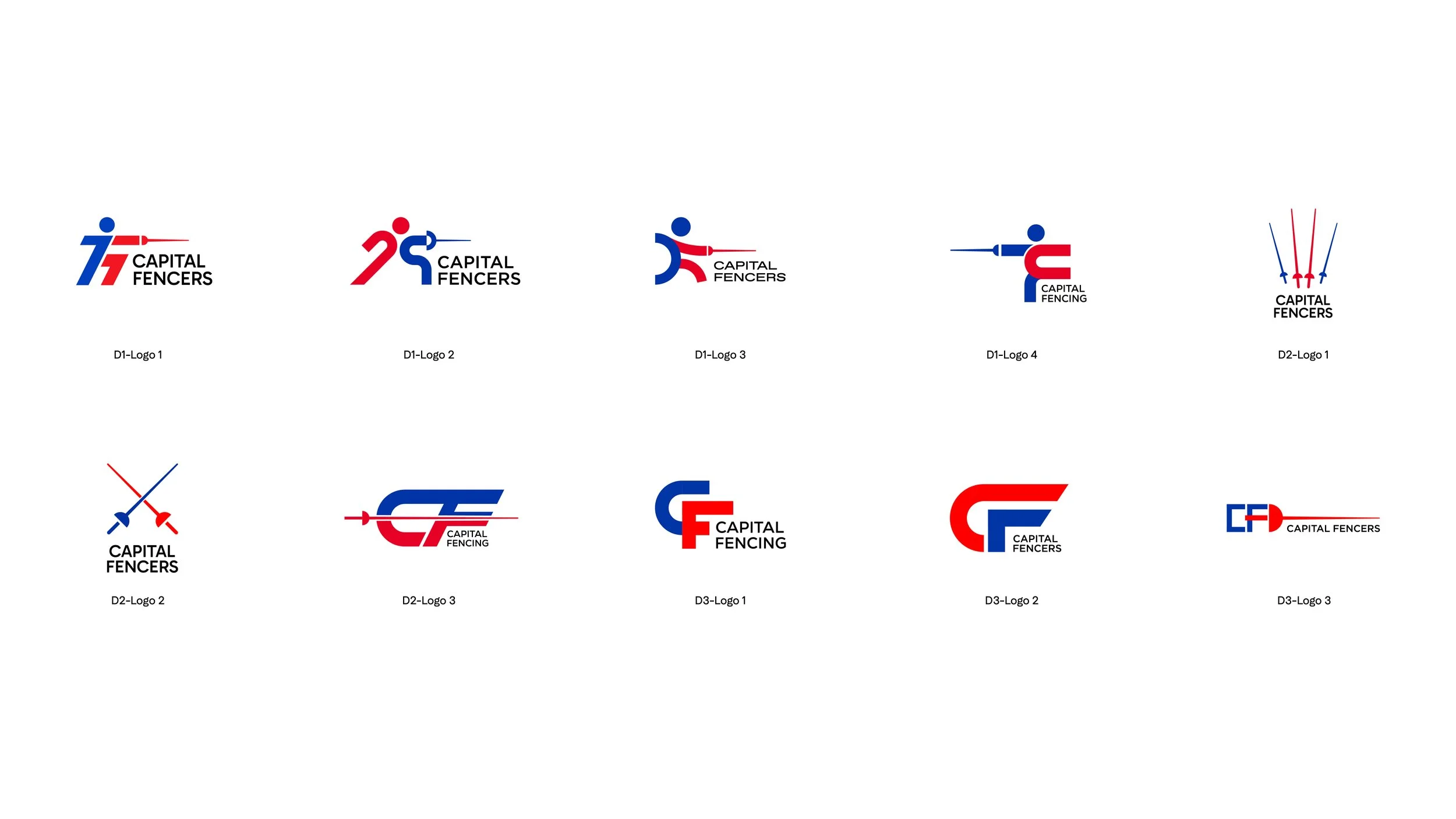
This project was developed for Capital Fencers, a start up Singaporean fencing academy, to create a minimalist and modern brand identity. The design explores two key directions: one emphasizing the épée as a central graphic symbol to highlight precision and discipline, and another incorporating a stylized human figure to capture motion, agility, and the spirit of competition. Both approaches use clean lines and simple forms to ensure the logo stands out while reflecting the academy’s focus on excellence and contemporary appeal.